In this tutorial, I have decided to show how to create a website. We know there are many different types of websites, but what is the process of getting that professional, or artistic, or educational page?
Your first step is to plan, plan, plan! You need to decide what your mission is and who your customers will be. Then you need to pick a domain name. This takes some consideration. Dont overlook this step. You want it to be convenient for people to find you. Are you going to use your business name, an abbreviation, .com, or .net? These are just some of the questions you need to ask yourself. A place to find "domain hosts" that could meet your needs and budget are: hostingreview.com, godaddy.com, microsoft office live, or 5hosts.com. Make a rough draft of how you want your page or pages to look like - text, images, and other graphic elements. Finally, you need to set a budget and decide who is going to do what.
Do you feel like you have the creative ability to create your own webpage? If so, then go for it! But if not there are plenty of Web Design Professionals out there willing to help you out.
3rd: Select The Tools For Making Your Home On The Web
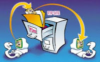
First you need to find a web hosting. This is necessary because a web host with accept your site, secure all your files, and make your page avaliable at all times. Some places you can start is: Web Hosting Review, Hosting Review, or ConsumerSearch. Then you need a FTP, File Transfer Protocol, so you can upload files to your website. You can download this for free at: FTP Navigator, FileZilla, or CoffeeCup Free FTP. If you have images on your page and dont hire a professional to take care of your photos and graphics then you will need to upload a digital photo and graphics editor. You can find free ones to download, but if you want to a more sophisticated, professional program you could use Adobe Photoshop.
4th: Make Key Design Decisions
This is where all your hard work from step 1 comes into play. Knowing who your target customers are will help guide you through the design process. Also, knowing if you will have any special needs that you will be accomendating will be helpful. Some general design principles are: keep it clean, never use dark text on a dark background, make your text as concise and straightforward as possible, choose your colors carefully, and don't be afraid to browse other successful websites for ideas.
5th: Learn The Code
This is the step for learning the basic language of the HTML. This will help you understand your webpages framework and give you control of everything on your page.
6th: Identify The Best Software For Words And Images
Now you need to decide what design software and other tools you are going to use. The two most common types of design software are: WYSIWYS and HTML. There are some better softwares that use both of these. However, if you are sticking to a more ridged budget set in step 1 then are may want to look at: Microsoft Office Live Basics, CoffeeCup HTML Editor, or Web Studio.
7th: Take Control Over The Look, Feel, And Function
This is mainly if you have an e-commerce site, because storefront and shopping carts can limit your choices. If you run into this problem the best thing to do is a hire a pro to get the look and feel you desire, and have your website function as you want.
You may have the best products and services on the Web, but it doesn't mean a thing if potential customers can't find your site. This is best accomplished by getting your website noticed by ranking high in search engines like google, yahoo, and MSN. This will probably be the most challenging step and also the most rewarding. This is best accomplished by having your web page contain keywords and phrases that you think potential customers will search with.
9th: Put All The Parts Together
By now, you have spent tons of time planning and assembling everything together and now you will receive the benefits of seeing it all come together and watching your site do its stuff. However, there are a few more steps you need to do to make sure all your work wasnt in vain. First use a test site. Then get reviews on your site. Try testing it on different platforms and browers, and track bugs and fix any problems as soon as you can.
10th: Take You Website Live
You have worked hard - planning, designing, coding, testing, and re-testing. And now you are ready to publish your site to the web. To take your webpage to the next level there are a few recommendations. You can register your search engine with google, yahoo, or MSN. You can buy ad placements or do a pay-per-click. Also, you could start a blog. None of this is necessary, it is just extras if you have any budget let over and want to get your website out there even the faster.
11th: Constantly Tend To Your Website
The care and feeding of your new business is as important as any of the other steps. Reasons for tending to your webpage is to keep things secure, manage your existing content, add new content and links, to be constantly promoting your website, and to keep up with your ads.
http://www.securepaynet.net/shared/Video/show_me_popup.aspx?app_hdr=99&ci=15389&show_vid=wst&prog_id=zappyhost
Work Cited
http://www.thesitewizard.com/gettingstarted/startwebsite.shtml
http://www.google.com/images?hl=en&biw=909&bih=781&tbs=isch%3A1&sa=1&q=domain+name&aq=f&aqi=g10&aql=&oq=
http://www.google.com/images?hl=en&biw=909&bih=781&tbs=isch%3A1&sa=1&q=domain+name&aq=f&aqi=g10&aql=&oq=
http://www.startupnation.com/steps/66/3780/11/1/website-maintenance.htm
http://4freephotos.com/Business-category-13.html?order=uploadedDESC
http://4freephotos.com/Business-category-13.html?order=uploadedDESC


